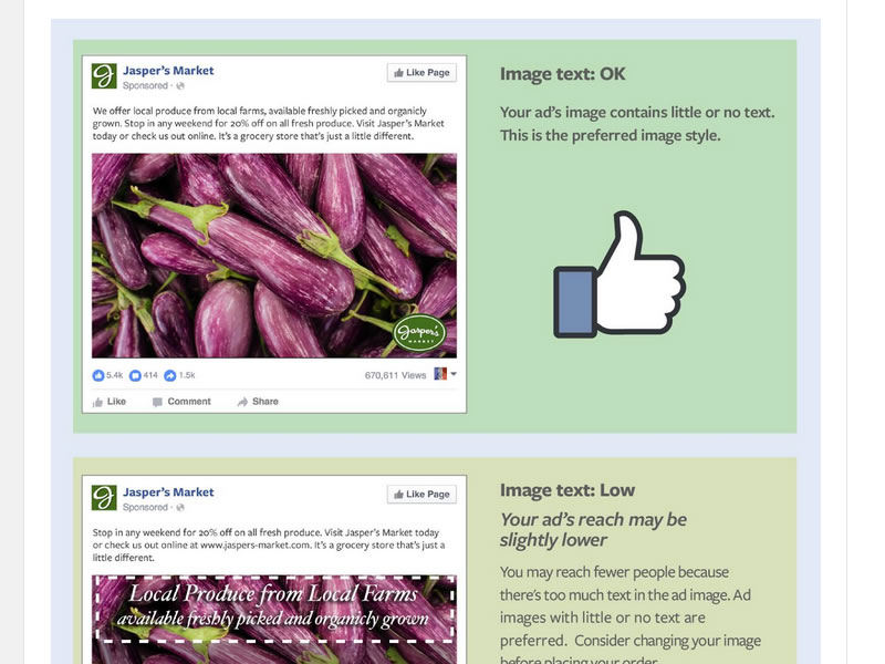
Facebook has changed it’s policy on disallowing ads with more than 20% text. There are now 4 bands in which your ad will be placed. OK, Low Text, Medium Text, High Text. The higher band your ad comes in the lower your quality score and less traffic you will get or higher you will have to bid.
We’ve found a few things out from our initial tests with the new guidelines.
Reducing the image size can get around the ad text guidelines when it’s borderline
 The same ad just reduced in size by 33% passes as OK where as the original was getting a warning message:
“Your Ad’s Reach May Be Slightly Lower
- You may reach fewer people because there’s too much text in the ad image. Facebook prefers ad images with little or no text. Consider changing your image before placing your order.”
One issue we’ve run into is that ads marked with higher text don’t get much initial reach. Unless they pick up momentum fast Facebook just sends 200-300 impressions and then pauses the traffic. Also worth noting is that the quality score is applied after fewer impressions, normally this is only applied after 500ish impressions.
 Here you can see that the bottom ad has only received 221 impressions and has been assigned a quality score and sent to idle ads camp.
Since the changes have come in it seems that almost all my successful ads are ones that have been marked as OK. So although the 20% rule may have changed it is in effect still very much part of the Facebook marketing strategy.
Here is some information from the Facebook advertisers guidelines:
Introduction
Previously, if 20% of an ad image’s area was text, it wouldn’t be approved to run on Facebook, Instagram or the Audience Network. While we still prefer ads with minimal text, we’ve adopted a new system that allows you to run ads that would’ve been rejected under our old policy. With our new system, ads with higher amounts of text will receive less or no delivery at all (unless we apply an exception). Use the text overlay tool to determine if your ad’s reach may be reduced by too much text on the ad image before you run your ad.
Adding a relevant image of your product or service can be one of the most powerful factors in determining the success of your Facebook ads. When you use images, try to include as little text as possible on the image itself. For any text you use in your ad, we recommend that you include it in the post, rather than the image. Our research has shown that people prefer to see ads with minimal image text.
Tips
-
If you need to include text in your image, try reducing the font size of your text.
-
Make sure most of the text you use is in the text box instead of directly on the ad’s image.
-
Avoid spreading text all over the image.
Examples of Text Overlay in Ads
Facebook ads that contain images with little to no text tend to cost less and have better delivery than ads with image text.
Image text can fall into one of 4 categories:

Exceptions
We understand that sometimes, you’ll need to use an image of a text-based product for your ad (calligraphy, infographics, movie posters, etc). Your image may automatically qualify for an exception.
Note: For product images, we don’t allow close up or zoomed in images of logos. Your image must show the entire product.
Note: We also allow for legal terms and conditions as it applies to the product in your ad.
See the examples below to understand some of the types of text that won’t limit delivery:
-
Book Covers–

-
Product Image –

What’s not allowed in my image? (does count as text)
-
Logos – Any text-based logo is counted as text regardless of its size or alignment
-
Watermark – Watermarks are considered as text, even if they’re mandatory or as per their brand guidelines
-
Numbers – All numbers are considered as text


