
For cynics technical analysis is seen as astrology for middle aged white guys for others it is the holy grail, which when mastered, inevitably leads to trading success.
The truth is somewhere in the middle, it is undeniable that price action reacts more at some levels than others. It’s important for anyone involved in investing or trading to understand how technical analysis affects markets and how it can be used as a tool.
https://www.tradingview.com/pricing/?share_your_love=jimbachini
In this article I’ll go through the fundamentals of charting with a particular focus on cryptocurrency markets. At the end I’ll provide a list of 21 market nuances which I’ve observed over 6 years of trading digital assets.
- Price & Volume
- Candlesticks
- Timeframes
- Market Cycles
- Support & Resistance
- Trendlines & Channels
- Moving Averages
- RSI & Oscillators
- Fibonacci Retracement
- Chart Patterns
- TradingView
- Market Pairs
- Market Nuances
Price & Volume
Technical analysis at first glance is a complex field of study which can take a lifetime to master. In reality, even the most complex indicators are derived from two data points: price & volume.
- Price data represents the price an asset trades at over time. Price is usually broken down into 4 values for a specific period i.e. the daily open, high, low, close (known as OHLC data)
- Volume data represents the number of shares, contracts or tokens traded during a particular period.
By analyzing the historical values of these data points, technical analysts gain insight into the supply and demand forces that are driving the market.
There are two kinds of forecasters: those who don’t know, and those who don’t know they don’t know
John Kenneth Galbraith
This highlights the inherent difficulty of predicting market movements with certainty based on limited past data. The best technical analysts read the charts with a healthy dose of humility and caution.
Candlesticks
The most commonly used method for laying out price data is through the use of Japanese candlesticks. These provide a visual representation of the open, high, low, close price data for the period being displayed.

Green or filled in candlesticks represent a period where price moved up, red or hollow candlesticks represent a period where price moved down.
When drawing lines on charts some analysts will use the open and closes, others will use the extremities of market moves plotting lines to the highs and lows. There is no correct answer as to which you should use but it is important to stay consistent.
Volume is usually either overlayed or displayed below the candles as a bar chart, again each bar represents the volume traded for a particular period of time.
Timeframes
Every TA chart will have a specified timeframe, a daily chart will show one candlestick for each day.
Longer-term periods such as daily, weekly, monthly charts are known as higher time frame charts. Short-term periods such as hourly and minute charts are known as low time frame charts.
Here is an example high time frame weekly chart for BTC/USDT. Each candle represents the price action and the bar chart below shows the volumes traded on this market at the Binance exchange.

Higher time frame charts tend to be more reliable and are less open to manipulation. For beginners a weekly or monthly chart provides a reliable way to analyse an asset and see the story of what price has been doing and where we might be in the market cycle.
Market Cycles
Market cycles and investor psychology are closely intertwined. Investors often struggle to navigate the ups and downs of the market and understanding market cycles and investor behaviour is essential for successful trading and investing.
A price chart can be used to analyse and estimate market sentiment and where price is relative to a market cycle.
One key point to understand is that cycles do not necessarily need to end where they started, and can instead follow an underlying secular uptrend. This means that investors should not simply assume that a market downturn will result in a complete reversal of the previous uptrend, but instead consider the longer term context of the market.
An appreciating asset will not go up in a straight line, the pendulum spends only a little time at the midpoint of its arc and is usually swinging towards one extreme or the other. This suggests that investors should be aware of the tendency for market movements to swing towards extremes.
If you take one thing from this content it is this. The wall street cheat sheet has provided more actionable insights about markets than entire books on the subject. You can use TradingView to pull up a high time frame chart for any asset then compare it to this.

There is a lot to digest from this infographic. The main chart depicts the human emotion that aligns with different parts of a market cycle. The simplified market cycle is the key to contrarian investing. Buying during a period of Euphoria is putting capital at risk at the point of maximum financial risk. While buying between periods of anger and depression offers maximum financial opportunity.
Timing the markets is impossible but knowing where you are in the market cycle and making +EV decisions based on that insight is extremely valuable.
During bear markets (downturns) investors become excessively risk-averse or exit the markets completely causing steep declines in price.
Prices tend to go up the staircase and down the escalator
This market dynamic holds value for participants with strong risk management who can take small losses and avoid large ones.
Risk aversion and pessimism never lasts forever and sentiment can shift rapidly as the market’s mood swings.
The safest time to buy is often when everyone else is convinced that there is no hope. This requires conviction and is much more difficult than it sounds. How many people bought digital assets when Luna, 3AC and FTX blew up and Bitcoin traded down to $17k? I did but I didn’t enjoy the experience, it felt like setting money on fire and risking my families livelihood, but this willingness to go against the prevailing sentiment can lead to significant opportunities for returns.
Technical analysis can provide a framework for assessing risk from a contrarian perspective. If the markets are up only then there is always significant risk of a correction or reversion beyond the mean. During periods of depression where interest and hope is lost you can pick up digital assets with minimal risk.
Your psychology will always work against us in these scenarios and it will always seem like a riskier investment in a bear market to a bull market. Technical analysis can aid in making decisions based on the data rather than our emotions.
Support & Resistance
Support and resistance are areas of significant interest for traders where price is expected to react as increased supply and demand affects a market.
The best example of this is a previous all time high for an asset. This is an area where volatility and volumes are expected to accelerate because it’s a clear line in the sand, above which the asset moves into price discovery mode.
There are a multitude of ways to mark up horizontal S&R lines on a chart. I think the simpler it is the more reliable it is. If a 5 year old can look at a chart and connect some peaks and troughs on a horizontal axis then it’s likely that every other traders is also looking at those areas.
A support line should identify a price where buyers are expected to step in preventing price falling further and equalize the supply from sellers. A resistance line should mark a level at which traders and investors are expected to take profits equalising the excess demand leading into it.
In crypto round numbers tend to be important (for no apparent reason other than human psychology) and trading will intensify around Bitcoin when it approaches $20k, $30k, $50k, $100k etc.
Levels can be formed when price moves to an extreme and then reverts marking the extreme as a new level, such as a new all time high. A level can also be formed where significant volume is traded at a price over a longer period of time.

In the chart above we see price move into the psychologically important $30k level in an extreme market decline. Bids come in at $30k and price rebounds off before recovering to make a new all time high. The second area shows price moving back in to the $30k level and ranging there for some time before going lower. The third area highlighted shows that after this previous action every trader has $30k marked and it significantly affects market dynamics as price moves in to this area.
Support and resistance levels offer a number of trading setups:
- Price reverting at a significant level, price bounces off a level and moves in the same direction from which it came
- Price goes through a level flipping it from resistance to support, this is a breakout patter where price can accelerate away from the level
- Price retests a level, after breaking out it comes back touches the original level and then goes again
- Fakeout reclaim, price looks like it reverts and then pushes back up to the level leading eventually to a significant breakout
- Ranging between support and resistance levels with lower volume and speculative interest
- Price wicks through a level to wipe out stops and grab liquidity from liquidations above or below resistance then reverts back aggressively
The crypto sector is famous for being “bullish at resistance” but there are frequent cases where price moves through a level, breaks out, accelerates away and never comes back. If you could predict this reliably you could make a lot of money but without a crystal ball you never know how price will react to a significant level. Expecting increased volatility, volumes and shenanigans is useful in it’s own right.
Note that it is extremely difficult to get good order execution when trading breakouts. Market makers lift orders and increase spreads, exchanges become unresponsive and delay response times, limit orders don’t get filled and market orders get punished with worse possible price.
Trendlines & Channels
Trend lines are diagonal support and resistance lines. They can provide a channel in which price will fluctuate as it slowly moves up.

This is the S&P500 moving up a channel during 2020 and 2021. The longer a channel like this forms the more significant it is when price eventually breaks out of it.
In crypto markets I don’t personally put much weight on diagonal trend lines as they tend to get broken as regularly as they hold. Price will often wick through a trend line to wipe out any stops from traders using leverage on the move.
Moving Averages
The most widely used indicator is a moving average which represents a historical average of the market price. For example on a daily chart you might have a 30 day simple moving average which will plot the average of the previous 30 days.
Moving averages are a lagging indicator meaning they update at a slower rate than the price itself. A 200d moving average will react slower to price changes than a 30 day moving average. This enables us to plot multiple indicators on a chart and create signals such as buying when the 30d crosses above the 200d.

The two most widely used moving averages are SMA & EMA.
The SMA (simple moving average) is calculated by taking the sum of closing prices over a certain time period and dividing it by the number of periods. A 30 day SMA would take the sum of the closing prices over the past 30 days and divide it by 30. The SMA gives equal weight to each price point in the calculation, regardless of how recent or old it is.
The EMA (exponential moving average) is used because it places more weight on recent price data, making it more responsive to changes in the market. This means that crosses and other signals happen sooner and more frequently.
There is an example of developing an entire trading strategy around using trend following with a moving average as a exit signal here:

RSI & Oscillators
Oscillators are indicators used to signal whether an asset is over-sold or over-bought. They oscillate within a defined range to provide a data point for traders to assess where the market is relative to previous swings.
RSI – Relative Strength Index
The Relative Strength Index (RSI) is a technical indicator that measures the strength of a security by comparing its average gains and losses over a given period. It is calculated by dividing the average gain over a given period by the average loss over the same period. This value is then plotted on a scale from 0 to 100. The RSI is plotted on a scale from 0 to 100, with values above 70 indicating that a security is over-bought, while values below 30 suggest that it is over-sold.
Bollinger bands
Bollinger Bands consist of three lines: a simple moving average (SMA) line in the middle, and two outer bands that are plotted two standard deviations away from the SMA line.
The SMA line in the middle of the Bollinger Bands represents the average price of a security over a specified period (default is 20d). As market volatility increases, the distance between the upper and lower bands widens, when volatility decreases the bands come closer together.
Bollinger bands provide a visually appealing tool that can be used to identify areas of likely mean reversion. I’ve used them in the past to time intraday entries and pick out times and bid levels where price is undervalued relative to the moving average.
MACD
The MACD is a trend following momentum indicator that compares the relationship between two moving averages. The MACD is calculated by subtracting a 26d exponential moving average (EMA) from a 12d EMA, with a 9d EMA used as a signal line. MACD is useful to identify areas where there may be potential long-term trend changes.
MACD has a cult like following of supporters and may, along with things like moving average crosses, have a self-fulfilling prophecy. The more market participants that use them, the more likely price is to revert due to indicators flipping and orders coming in.
Fibonacci Retracement
I’ve found Fibonacci retracements most useful when trading altcoin pullbacks in bull markets. When price goes into discovery on an asset and you want an entry but don’t know where to buy, there are no levels or previous price history to consider. In this situation Fibonacci levels and round numbers is all you have to try and get a reasonable entry.
The indicator is based on the Fibonacci sequence, a mathematical sequence of numbers in which each number is the sum of the two preceding numbers. As price pulls back key Fibonacci ratios of 0.236, 0.382, 0.5, 0.618 can be plotted on a chart to provide a pseudo-support level.

In this chart we have a big spike up which quickly retraces. The 0.236 Fibonacci level lines up with previous peaks and price spike highs. This turns resistance to support and offers another data point to suggest it will act as strong support. Price comes down touches the level and then moves back up from the $30 level providing a clear entry for anyone paying attention.
Chart Patterns
History doesn’t repeat but it rhymes and you’ll see these chart patterns frequently in the charts.

A double top shows a strong resistance is holding and bulls are struggling to break through the level. Head and shoulders patterns are failed attempts to make a higher high. Expanding triangle and rising wedges offer reasons to be cautious following big moves. Bullish reclaim I’m not sure if this is a real pattern but a failed breakout that reclaims the level is usually a sign of strength. Cup and handle however ridiculous shows a slow down in volatility followed by a move away from the level. In big moves you often get three surges in price followed by flagging where price settles for a brief time before continuation. Finally an ascending triangle is when price butts up against resistance continuously until it eventually breaks out in spectacular fashion.
TradingView
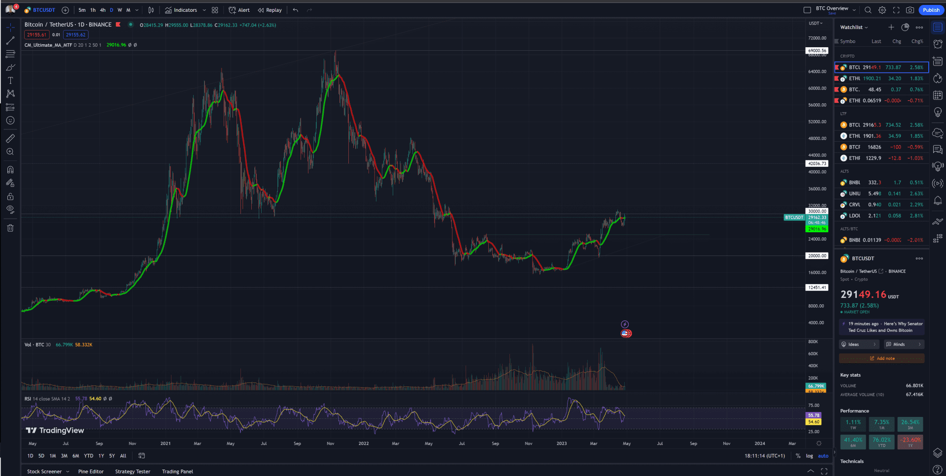
All the charts posted in this tutorial are screenshots of TradingView the most popular charting platform.
The platform is freemium with a fully featured free tier. If you want multiple charts, screens and indicators then you’ll need a paid subscription.
The software is powerful for technical analysis and strategy development and even has it’s own coding language PineScript.
Set up an account, choose a market (includes stocks, forex, indices and crypto), add your favourite indicators from a massive open source library, build a watchlist, set up alerts, compare multiple asset correlations, draw some lines on charts. There’s a lot you can do with TradingView but it’s relatively intuitive and not a steep learning curve.
As with any software application, if you are going to be using it a lot, learn the shortcuts.
TradingView is the go to application for Technical Analysis, if you have any involvement in the markets it’s worth having access to the industry standard charting software.
Market Pairs
Every chart shows the price of an asset relative to a base asset. For the most part we associate price with the US dollar and the vast majority of markets are priced against USD or USD based stablecoins.
Some of the most valuable charts however are the markets where the base asset is another volatile digital asset.
A few years ago ALT/BTC charts used to be very valuable because everything traded against Bitcoin. I would swap local currency (GBP) for Bitcoin and then swap that for altcoins because stablecoins weren’t as widely used.
Today charts for ALT/ETH pairs are very valuable because it shows how price has performed relative to the market using ETH as a pseudo index. If an altcoin isn’t showing relative strength against ETH then your funds are probably off in a staked Ethereum position.
More frequently today, alts are traded for ETH directly on decentralized exchanges like Uniswap where ETH is commonly used alongside stablecoins as a base asset in ALT/ETH liquidity pools.
If something is making higher highs and higher lows against ETH then the relative strength may be worth the increased volatility as you move up the risk curve.

SSV/ETH chart deciding where to go next, while I’m trying to decide if the risk of a low liquidity altcoin is worth the strength relative to stETH (ETH +5%APR).
Market Nuances
In every market sector there are nuances which you pick up on when you follow the charts.
After watching crypto markets obsessively for 6 years here are some unscientific observations
- Bitcoin tends to lead the market, Ethereum follows Bitcoin, Alts follow Ethereum. There was a period in 2022 when ETH seemed to be leading BTC but for most of 2023 we have mainly seen Bitcoin bids impacting the market
- Narratives shift every 2-3 weeks like miniature market cycles and front-running them is very profitable if you have exposure early
- After a Bitcoin does it’s thing and puts in some big green candles, markets can cool off as it flags and alts will play catch up. The in-vogue altcoins during this period can 2x overnight. #AltSzn normally only lasts a couple of weeks but if you time it right it’s the period of maximum opportunity for trading
- BTC.D (Bitcoin dominance) is an important chart but no one knows why. The price has bounced off the 40% level more times than a hyperactive kangaroo on a trampoline
- ETH/BTC is important too as Bitcoin is often the lowest volatility (don’t laugh) digital asset, if it’s showing relative strength then it has a higher sharpe ratio because of this
- A significant TWAP spot bit can lead to a massive futures bid as traders try to frontrun institutional investment in crypto markets
- Newsflow, true or false, can affect the market. We can stay stupid longer than you can stay solvent
- Funding rates get excessive and can stay excessive for long periods on futures exchanges. This opens up the opportunity for lucrative basis trades
- Markets are manipulated but no one is targeting your stops unless you are trading 9 figures or putting a stop loss 1% below an obvious support level. In which case expect to get wicked
- Insider trading is widely accepted and the charts often show something is going on before the news is released
- Markets are 24/7 which is a blessing and a curse. If you have an important position or are trying to get a perfect entry, don’t expect to get much sleep
- Whole numbers get bid, 888 gets bid, 420 gets bid, the vast majority of trading is algorithmic but humans are weird and these anomalies still show up
- Most of the liquidity is still on centralized exchanges, vast majority of which is on Binance. Spot bids on Coinbase are important too as institutions like Microstrategy tend to TWAP there
- Mr Market has never been more irrational, crypto Twitter is a daily reminder of the bi-polar effect that price movements can have
- Many traders use exactly 10x leverage because it’s default across many exchanges. When there’s surges in speculative trading these levels get targeted and liquidated
- When things get really frothy it leads to liquidation cascades where bids get pulled and the market disappears as exchanges fight for liquidity to ease their liquidation mechanisms. FTX had a lagging liquidator which was fun for a while until they went gambling with users funds.
- There are special situations when something happens in the industry and risk/reward gets distorted so much that there are incredible trades if you can react fast and with conviction
- Don’t catch falling knives (note to self)
- Fundamentals matter, invest in longevity
- USD is devaluing at an accelerating rate due to inflation, relative to USD it’s easy to “make money”, relative to other assets it’s much harder to gain purchasing power. Compare your performance relative to SP500, BTC or stETH.
- More screens = better

